This week’s toy: how much is a Zettabyte? I hope the answer to this question doesn’t sound really weird in the future when we talk about how many zettabytes could fit on a USB stick or the equivalent once there is some brand new superfast and vast storage medium. Edition No. 54 of this newsletter is here - it’s August 3, 2021.
The Big Idea
Dashboards answer the “Why” for a customer
Almost everyone loves a dashboard. It tells you the most important things about your business. Except when it doesn’t. Because the more common implementation of dashboard looks more like “group a lot of reports that different people think are useful” or “statistics that the team would like you to know and haven’t yet validated are the things you care about.” So what would a better dashboard look like?
A better dashboard starts with a few guiding principles:
The items at the top need to be the most important metrics. How many times have you opened a report and found that the thing at the top doesn’t matter? Please build your dashboards with the viewer in mind. What is their WHY?
The dashboard needs to have a clear “WHY” that it answers for the viewer. Who is looking at the dashboard, why did they come here and did it answer their question?
Once the dashboard answers the “WHY”, it needs to have a clear BENEFIT for the viewer, and the viewer needs to know how to use it. This looks like insight when done right.
There are other items that you might call out: things like UI/UX consistency, consistency in the type and order of magnitude of the things described, and the ability to drill deeper into the numbers you find. At the core of it you want to get benefit from visiting the dashboard, not be left with a head-scratching feeling of wondering what to do with the information.
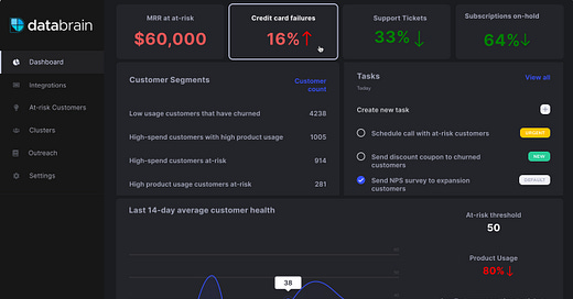
Here’s an example from the Databrain website that does a solid job at these three principles, adding in a few more things that improve numeracy and readability for a dashboard.
Why does this work as a dashboard?
1) The view has a few (not too many) top-line metrics with numbers and directional indicators (how are we doing)
2) There is a secondary area indicating segments/counting and tasks to do (where do we need to investigate)
3) There is a time series of important data indicators changing (what happened)
The combination of color, directionality of data, and the information prioritization helps us know where to look. I’d hope that solving the tasks presented in this view results in feedback on whether solving the tasks improves or degrades the metrics. This is a great place to start.
What’s the takeaway? The information architecture and design of a dashboard should be a first class citizen when you are determining what to do, how to alert on it, and how to identify insights for the dashboard user. Having a clear “WHY” will make this easier, and delivering insights that answer that “WHY” will make the viewer come back and view the dashboard again.
A Thread from This Week
Twitter is an amazing source of long-form writing, and it’s easy to miss the threads people are talking about.
This week’s thread: the person who coined “everything starts looking like a toy” reprises his thoughts:

Links for Reading and Sharing
These are links that caught my eye.
1/ Get up to speed on a new thing, faster - Josh Comeau writes on learning how to learn. This is a key skill for almost anyone, and Josh breaks it down like a developer. His keys to success: use some scaffolding (for example, tutorials), but riff on that scaffolding like a chef adapting a recipe. If you don’t understand an example inside and out, you might not understand the concept. But if you try something completely new, you might wander in the figurative desert before learning. So try a hybrid approach.
2/ That interface looks weird, but why? - When you look at a website, it might just look … wrong for some reason. This is a great thread of common use cases to test against the websites you use or design to avoid the most obvious problems. You might get a few great ideas in the process of reviewing the rules, too!

3/ Change is compounding, and growing faster - Here’s an insightful piece about the power of compounding change. It’s starting to feel weird out there and change may be speeding up.
On the Reading/Watching List
What is the “Metaverse” and how will we know when it’s here? Matthew Ball writes that it’s about much more than VR,AR, or other forms of overlay on reality. The Metaverse, he writes,
[is] … a sort of successor state to the mobile internet. And while consumers will have core devices and platforms through which they interact with the Metaverse, the Metaverse depends on so much more. There’s a reason we don’t say Facebook or Google is an internet. They are destinations and ecosystems on or in the internet, each accessible via a browser or smartphone that can also access the vast rest of the internet.
Parts of the future are here. We don’t see all of them yet and the way that we view, engage with, and consume information will be very different.
I’m hyped for Marvel/Disney+’s “What If…?” It’s the perfect companion to the new direction in the MCU. Where in past years, What If… was just an idea and a niche 1970s-80s comic, it could now become mainstream storytelling.
What to do next
Hit reply if you’ve got links to share, data stories, or want to say hello.
I’m grateful you read this far. Thank you. If you found this useful, consider sharing with a friend.
Want more essays? Read on Data Operations or other writings at gregmeyer.com.
The next big thing always starts out being dismissed as a “toy.” - Chris Dixon


